Task 1.2
Three good Websites
In this task we are going to discuss three good websites that I use regularly.
“Digital design is like painting, except the paint never dries.”
Neville Brody
1. Skyscanner .net

Skyscanner allows users to compare cheap flight prices from all major airlines and travel agents, and find the cheapest tickets to all their favorite destinations.
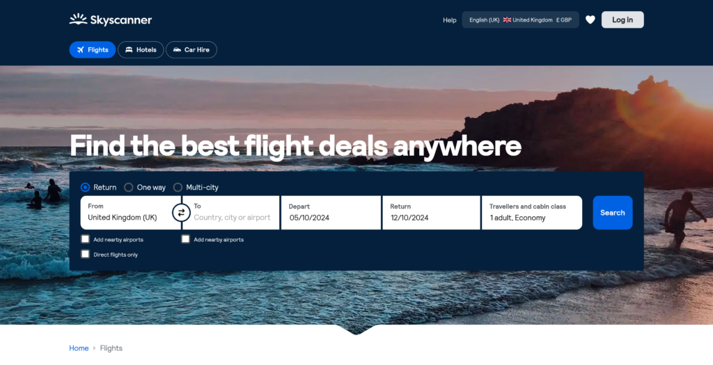
The website is simple and yet very effective as it is goal focus and the user can search for their flights easily and quickly, with the layout of the search bar found in the middle of the home page.
The search bar offers the opportunity to the user to navigate the different features of the website without constantly opening new tabs or windows.
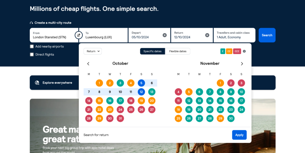
User friendliness is another key point for the website. Upon selecting the dates for the flight the user is searching for, the website displays the date along with a key for their color coding. Dates are highlighted according to average prices for the specific flight being searched, making it much easier for the users to filter their search even further.
What makes Skyscanner one of my personal favorite is the fact that I can access different services all on one website and the transition between the services are seamless. I can get the best price while having full control on my search with little to no disruptive ads or sponsors. This is also confirmed by the numerous other users.
2. FotMob.com

FotMob gives you all the live scores, stats, and storylines to keep you up to speed with the world of soccer. Personalized news and notifications make it easy to follow your favorite teams and players. And lightning-quick match updates make sure you never miss a goal, no matter where you are.
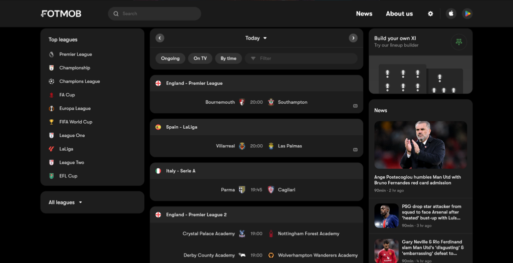
FotMob is one of the best websites for football fans. The user experience when using it is fantastic as users are given every piece of information in such an orderly manner. Various data are being delivered to the user with ever feeling overwhelmed. This is made so as the data are well classified and grouped together.
The distribution of content on the webpage is what makes it appealing to the user. For example on the screen itself we have loads of information but they are all in their own section allowing the user to have a good overview of everything while still allowing the user to focus on any piece of information being displayed.
Come On You Spurs !!
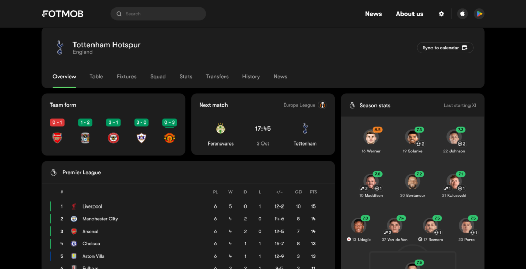
What makes FotMob a great website according to me is the ease of use of the website along with the amazing planning of all contents available to the user.
3. MyRetroTVs.com
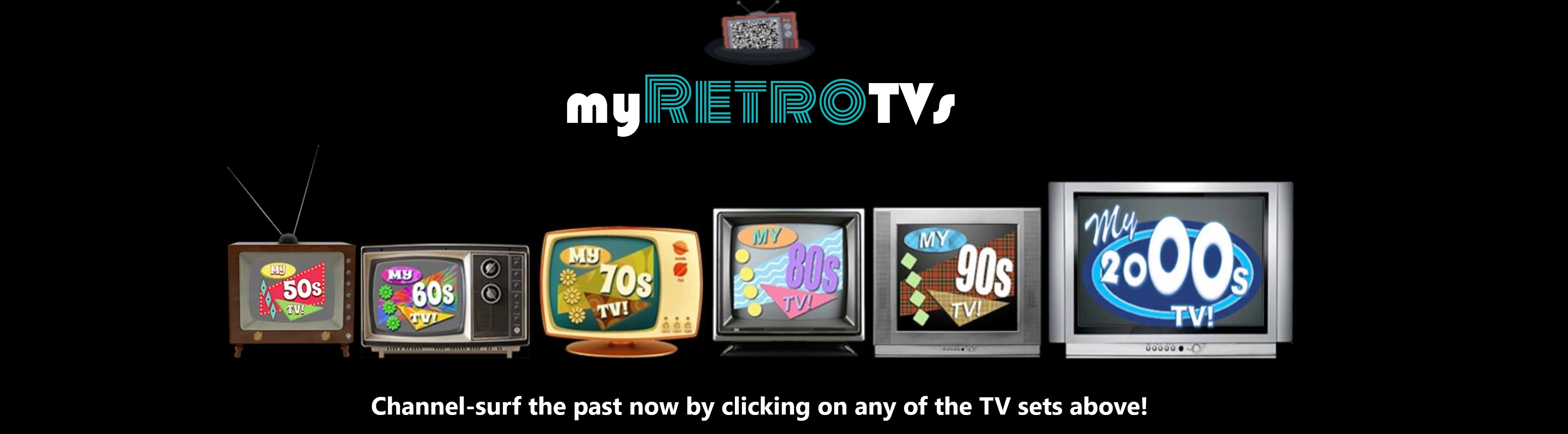
MyRetroTVs was created as a tribute to the beloved pop culture of the bygone eras, offering you the vintage experience of flipping through TV channels from a specific time period and trust me it does exactly that.
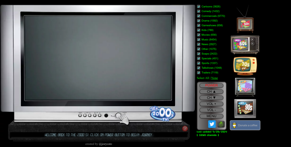
Seems familiar? The simplicity of the website brings back to nostalgia of the 50’s, 60’s, 70’s, 80’s, 90’s and 00’s. The design of the website is such that users only have to use a simple click on the old school remote to switch on the TV and zap around like the good old days.
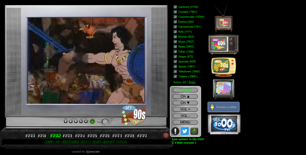
The website to me is a very good design as it is very goal focused. The key point of the website is nostalgia and with the simplicity involve it does just that and it does it perfectly. The website also allows users to apply some filters while still having to zap in order to find something according to their taste, which from my point of view is a once again focusing on the nostalgia.
Some other additional features are added to further immerse the user in the chosen era. Depending on the years selected, the TV changes accordingly. Another great feature is the static noise use when changing channel. Those attentions to the details and the simplicity of the website is simply amazing.