This report provides a comparative analysis of two versions of the Recursive Records website, created for the same small business. The purpose of this redesign was to address usability challenges, improve performance, enhance accessibility, and refine the visual identity of the brand. By examining the original and updated versions, this report will explain the reasons behind each change and how they contribute to an improved user experience and business outcome.
Site Structure & Navigation
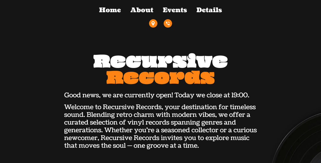
In the original website, all content was consolidated into a single-page layout. While this approach simplified navigation in the short term, it became increasingly difficult to manage as more content was added. Users had to scroll extensively to access information, and search engines had limited opportunities to index individual pieces of content.
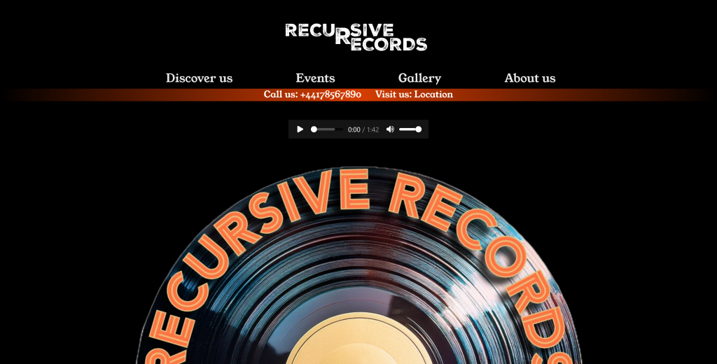
The new version introduces a modular, multi-page structure using PHP files. Pages such as About, Events, Contact, and Accessibility are now separate and accessible through a clear navigation menu. This change improves usability by allowing users to reach specific information quickly while also enhancing search engine optimization by giving each page its own URL and metadata. From a maintenance perspective, it also becomes easier to update or expand content in the future.
Visual Design & Branding
The visual identity of the original website was functional but lacked distinctiveness. Typography was limited to basic fonts, and colour schemes, while consistent, did not fully reflect the character of the brand. Interactive elements were minimal, resulting in a flat user experience.
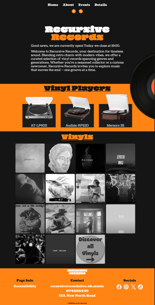
In the redesigned version, a more deliberate use of typography and color has been applied. The introduction of the “Oi” and “Coustard” fonts gives the website a more defined personality, aligning with the retro-modern aesthetic of Recursive Records. The color palette was refined using CSS variables, ensuring visual consistency and simplifying future adjustments. The design now incorporates hover effects, image filters, and subtle animations, all aimed at creating a more engaging browsing experience that captures user attention without overwhelming them.
Accessibility Improvements
Accessibility was a significant area of improvement. The original site lacked basic accessibility features such as skip navigation links, comprehensive alternative texts, and clear focus states. This limited the site’s usability for individuals relying on screen readers or keyboard navigation.
The new version addresses these shortcomings by introducing a “Skip to content” link, improving contrast ratios, and refining focus indicators. Interactive elements have been made more accessible through clearer states, ensuring compliance with accessibility standards and providing a more inclusive experience for all users.
Content Organization & User Experience
Previously, content was presented in large, dense blocks, making it difficult for users to scan and digest information. The lack of visual hierarchy and modularity hindered both readability and engagement.
With the redesign, content has been thoughtfully organized into dedicated sections for vinyl players, gallery items, events, and team members. This modular approach improves scannability and allows users to focus on the information that interests them most. Enhanced layouts, including card-style containers and hover-reveal interactions, guide users intuitively through the website while maintaining visual harmony.
Interactivity & Dynamic Features
The original website featured a basic JavaScript function to display the shop’s open or closed status. While functional, it lacked nuance and did not adapt well to varying schedules or user contexts.
The new version introduces a more robust script that dynamically generates greeting messages based on the current day and time. This contextual approach provides users with accurate, real-time information about the shop’s opening hours, enhancing the overall user experience and fostering trust in the business’s online presence.
Performance Optimization
Performance was another critical focus of the redesign. The single-page layout of the original version led to longer load times, especially as more images were added. Although some performance techniques like lazy loading were in place, the overall structure was not optimized for scalability.
In the new version, images are optimized and modularized, with galleries utilizing grayscale previews that load quickly and transform on hover. CSS has been streamlined to load only necessary styles for each page, reducing unnecessary bloat and improving load times across the site.
SEO & Scalability
From a search engine optimization standpoint, the original site’s single-page structure limited visibility. Only one meta description was present, and content was not segmented in a way that would allow search engines to index it effectively.
The new multi-page structure solves this by enabling unique meta descriptions and structured URLs for each page. This not only improves visibility in search results but also lays the groundwork for future content expansion, such as blog posts, product pages, or event updates, making the site more scalable and adaptable to business growth.
Conclusion
The updated Recursive Records website represents a comprehensive improvement over its predecessor. Through deliberate enhancements in structure, design, accessibility, interactivity, and performance, the new version offers a more engaging, inclusive, and user-friendly experience. These changes not only elevate the brand’s digital presence but also ensure the website is better equipped to support the business’s long-term goals of community building, customer engagement, and online visibility.
This article focuses on the key points about Progressive Web Apps (PWAs) that was delivered on the 19th of February. A PWA is a modern web technology that bridges the gap between traditional websites and native mobile applications. The objective was to introduce key concepts, features, and implementation techniques of PWAs while highlighting their benefits for web developers and users alike.
A Progressive Web App is a type of web application that is designed to provide a native app-like experience using modern web technologies. Unlike traditional websites, PWAs can function offline, load quickly, and deliver push notifications, making them highly interactive and user-friendly. Since they are accessible through web browsers, they eliminate the need for app store installations, making them easier to distribute.
Key Features of PWAs
Progressive Enhancement – PWAs work for every user, regardless of the browser or device they use.
Responsive Design – They adapt seamlessly to different screen sizes and resolutions.
Offline Functionality – Through caching and service workers, PWAs can load even when there is no internet connection.
App-Like Experience – They mimic native apps with smooth interactions and transitions.
Push Notifications – PWAs can send updates to users, improving engagement.
Fast and Reliable – Efficient caching allows them to load quickly, even on slow networks.
Secure – PWAs run on HTTPS, ensuring a secure connection and preventing unauthorized access.
No App Store Required – Users can install PWAs directly from the web, bypassing app stores.
How PWAs Work(Three main components define a PWA)
HTTPS Protocol – Ensures a secure connection, protecting user data.
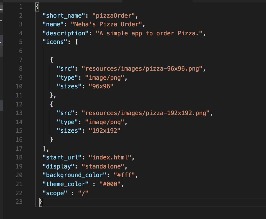
Manifest.json File – Contains metadata such as the app name, icons, theme colors, and display mode, helping browsers understand how the app should appear and behave.
Service Workers – These are JavaScript files that run in the background and manage caching, push notifications, and offline functionality.
Manifest.json
The manifest.json file is a critical component of a PWA, serving as a configuration file that provides metadata about the application. It helps browsers understand how the PWA should behave when installed on a user’s device, allowing for a more native app-like experience.
Name and Short Name: The full and abbreviated names of the app, displayed on the home screen.
Start URL: Defines the entry point of the app when launched.
Display Mode: Controls whether the app appears in fullscreen, standalone, or browser mode.
Icons: Specifies the images used when the PWA is added to the home screen.
Theme and Background Colors: Helps set the visual styling for the splash screen and app appearance.
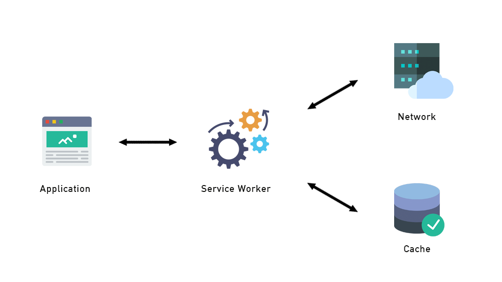
Service worker
Service Workers act as a middle layer between the application, the network, and the cache, enabling efficient resource management and offline functionality. As shown in the image, a Service Worker intercepts network requests from the application and determines whether to serve cached content or fetch new data from the network. This mechanism allows PWAs to load faster, function offline, and improve performance, making them a key feature of modern web applications.
Pros of PWAs
Increased Accessibility – Users can access PWAs across different devices without the need for installation.
Reduced Development Costs – Since PWAs work across platforms, developers do not need to create separate apps for iOS and Android.
Better Performance – Faster loading times and offline capabilities lead to improved user satisfaction.
Improved Engagement – Push notifications and home screen installation make users more likely to interact with the app.
SEO Benefits – Unlike native apps, PWAs are indexed by search engines, increasing their discoverability.
Examples of Successful PWAs
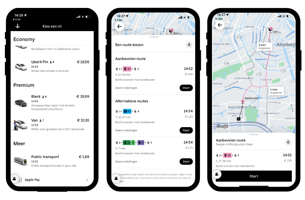
Uber – Provides a fast, app-like experience even on low-end devices.
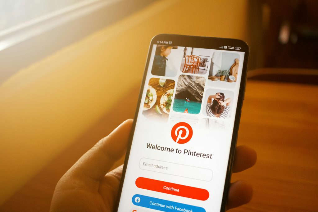
Pinterest – Their PWA increased engagement and reduced bounce rates.
Conclusion
Progressive Web Apps are revolutionizing the way users interact with the web, offering a seamless blend of web and mobile app functionalities. With advantages like offline accessibility, push notifications, and enhanced performance, PWAs are set to become the standard for web applications. As more businesses recognize their potential, PWAs will continue to shape the future of web development, making the digital world more accessible and efficient for everyone.
The goal of this portfolio website is to display both my design and development skills, making it an effective tool for attracting employers and recruiters. I want this website to serve as a professional showcase that I can be proud of, demonstrating my creativity, technical expertise, and unique approach to web design. To engage with my employers and recruiters my portfolio is to be as forward as possible and easy to navigate. I am to display all my works and codes that will showcase my professionalism and my ability to apply the best practices while coding.
2. Target Audience
Recruiters & Employers: Individuals looking for skilled web designers and developers.
General Audience: Anyone interested in my services and skills.
I will target recruiters and employers as my goal is to be able to have an opening in a tech company in Luxembourg. Thus I will also have my portfolio in English and French as most of the Luxembourg companies are bilingual companies.
3. Website Structure & Content
The website will consist of multiple sections designed to effectively present my skills and experience:
Homepage: A visually striking page highlighting my design skills, showcasing my best work with a clean and interactive layout.
About Me Page: A mix of formal and informal content to introduce both my personal and professional background. This page will reflect my personality while maintaining a professional tone. I will also have an interactive timeline of my educational background over the years to display my path to becoming a web designer.
Projects Portfolio:
MA Web Design Projects: A showcase of the projects completed during my Master’s in Web Design and Content Planning.
Graphic Designs: Insights into my graphic design that I made for my websites.
Contact & Socials:
Easy access to my social media links and professional profiles.
A clear call-to-action (CTA) for visitors to contact me effortlessly.
3.1 Prototype of the website/my vision
Simple and light homepage. Option to switch from light to dark mode.
About me page with hero image and introduction followed by a grid layout of my different work completed over the years.
A compilation of my work I completed during my MA web design and content planning.
An example of how I want to present my work.
4. Visual & Branding Approach
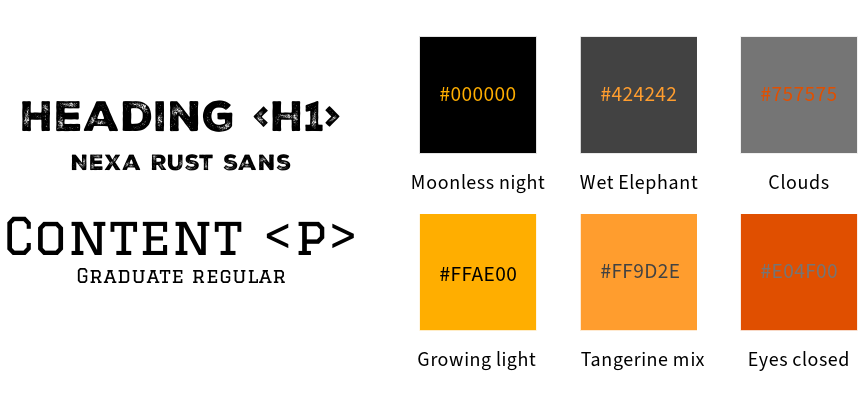
Color Scheme: A black and orange theme for a modern and professional look.
Typography:
Bold & striking font for headers.
Formal yet readable font for body text, ensuring a balance between playfulness and professionalism.
Imagery:
Black and white portraits of myself to maintain a sophisticated and cohesive visual identity.
Minimalist layout with carefully placed detailed design elements to subtly showcase my skills.
5. Technical Approach & Features
Front-end Development:
The website will be fully hand-coded to demonstrate my HTML, CSS, and JavaScript skills.
Well-written, structured, and annotated code to highlight best coding practices.
Interactivity & Animation:
Inclusion of 3D objects and interactive animations to showcase my 3D modeling and web animation skills.
Smooth transitions and engaging UI/UX elements to enhance user experience.
Usability & Accessibility:
The website will be easy to navigate, ensuring a seamless experience for visitors.
Responsive design to optimize for any devices views.
6. Success Criteria
To evaluate the effectiveness of my portfolio, I will measure success based on:
User Engagement: Visitor interactions, time spent on site, and feedback.
Recruitment Opportunities: Number of job offers, interviews, or collaborations initiated through the portfolio.
Aesthetic & Technical Execution: Ensuring the site remains visually appealing, professional, and technically sound.
This portfolio will serve as a reflection of my expertise in both design and development, reinforcing my ability to create aesthetically pleasing, well-coded, and user-friendly websites.
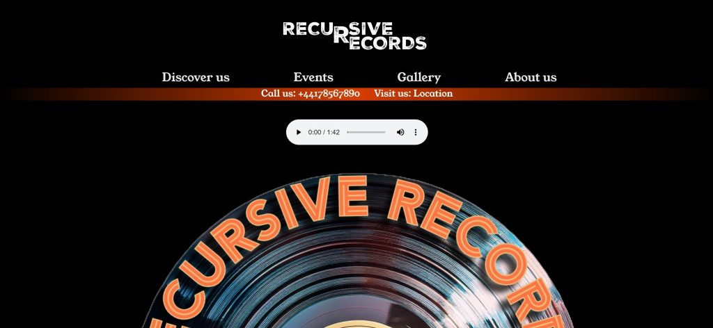
This report provides an overview of the development process of the website for Recursive Records, a vinyl record shop. The project was undertaken as part of my MA in Web Design and Content Planning, and it served as an opportunity to enhance my technical and design skills. The website can be accessed at https://ridj.uk/design-for-web-content/SBW-v3.0/.
Development Process and Key Learnings
During the development of this website, I explored various web technologies and improved my proficiency in front-end design and development. Several key areas of learning emerged from this project:
CSS Flexbox and Grid To achieve a well-structured layout, I delved into CSS Flexbox, which helped me efficiently align and distribute elements within containers. Additionally, I experimented with CSS Grid, which provided greater control over the layout, particularly in structuring complex sections of the website. Through this, I gained a deeper understanding of when to use Flexbox for one-dimensional layouts and Grid for two-dimensional designs.
Figure Element for Gallery Creation I utilized the <figure> element to create an image gallery that enhances the visual presentation of vinyl records. This allowed for better semantic HTML structure and improved accessibility, ensuring that captions and images were properly linked for a more meaningful user experience.
Background Gradient Implementation To create a visually appealing interface, I experimented with CSS background gradients. This technique allowed me to blend colors smoothly, giving the website a more modern and engaging aesthetic. The use of gradients contributed to a polished look that aligns with the retro-modern theme of Recursive Records.
Image Optimization with WebP Format One of the technical improvements I implemented was converting images to the WebP format. This resulted in significantly reduced file sizes while maintaining high image quality, thus improving the website’s performance and loading speed. This optimization plays a crucial role in enhancing user experience and SEO rankings.
Introduction to JavaScript and Attribute Manipulation This project marked my first hands-on experience with JavaScript. I explored JavaScript attributes to add interactive elements to the website, enhancing user engagement. Learning how to manipulate attributes dynamically opened up possibilities for future enhancements, such as interactive animations and real-time content updates.
Challenges and Overcoming Them
While working on this project, I encountered a few challenges, primarily in learning and implementing new technologies. Adapting to CSS Grid required multiple iterations before achieving the desired layout, and understanding JavaScript attributes initially proved challenging. However, through research, online tutorials, and trial-and-error, I successfully overcame these obstacles and expanded my skill set.
Conclusion
Building the Recursive Records website was an enriching experience that deepened my understanding of modern web design principles. The project allowed me to explore layout techniques with Flexbox and Grid, improve accessibility with semantic HTML elements, optimize performance through WebP images, and introduce JavaScript for interactivity. This hands-on experience has significantly contributed to my growth as a web designer and developer, equipping me with valuable skills for future projects.
User Experience Design (UXD) is a cornerstone of successful web development, ensuring that a digital product is not only functional but also user-friendly and engaging.
The success of any web-based project relies heavily on the user’s ability to interact seamlessly with the platform.
A well-executed UXD process ensures that the goals of the project align with user needs, promotes accessibility and inclusivity for a diverse audience, optimizes navigation and overall usability, and enhances engagement by fostering user satisfaction and encouraging repeat visits.
Research context
This research aims to identify the needs of people traveling to Mauritius who are seeking an authentic island experience. The project is designed to highlight the beauty and peacefulness of local life in Mauritius. By showcasing this lifestyle, the goal is to promote the island’s rich historical and cultural background while providing travelers with a unique perspective on what makes Mauritius special.
The project seeks to not only bring recognition to unsung local heroes but also promote their contributions to the cultural and culinary heritage of Mauritius. By presenting an authentic view of Mauritian life, the website will foster deeper connections between travelers and the island’s roots. This exposure will encourage tourism by facilitating access for travelers and also inspire visitors to appreciate and preserve the island’s traditions.
Research Objective
What do I want to learn?
How do people currently plan their trips to Mauritius?
What types of content do travelers want to see on a website when visiting a country or island?
Which website features could help tourists maximize their time on the island?
Assumptions
Travelers to Mauritius are food enthusiasts.
Tourists enjoy supporting local entrepreneurs.
Visitors are willing to explore the island to discover authentic local food spots.
Most tourists focus on hotels and restaurants that don’t always offer authentic Mauritian cuisine.
Hypotheses
This project will enable users to research and locate local food spots in Mauritius.
Travelers will be able to plan their itineraries based on the type of food they wish to explore.
The project will increase interest in visiting Mauritius by showcasing the island’s authentic lifestyle.
Target audience
Primary audience: Travelers and potential tourists planning trips to Mauritius.
Secondary audience: Local residents of Mauritius who want to share or promote their culture and businesses.
Existing evidence
According to ‘Statistics Mauritius’, approximately 997,290 tourists visited Mauritius in 2022, and this number increased to around 1,295,410 in 2023.
More details of the ‘Statistic Mauritius’ can be found here
Methodology
This study adopts a qualitative methodology to gain a deeper understanding of the experiences and preferences of tourists traveling to Mauritius. A qualitative approach will provide insights into the motivations, behaviors, and expectations of the target audience.
Participants
Participants will include:
People who have never traveled to Mauritius.
Tourists who have visited Mauritius.
Local residents who can provide insights into authentic Mauritian life and cuisine.
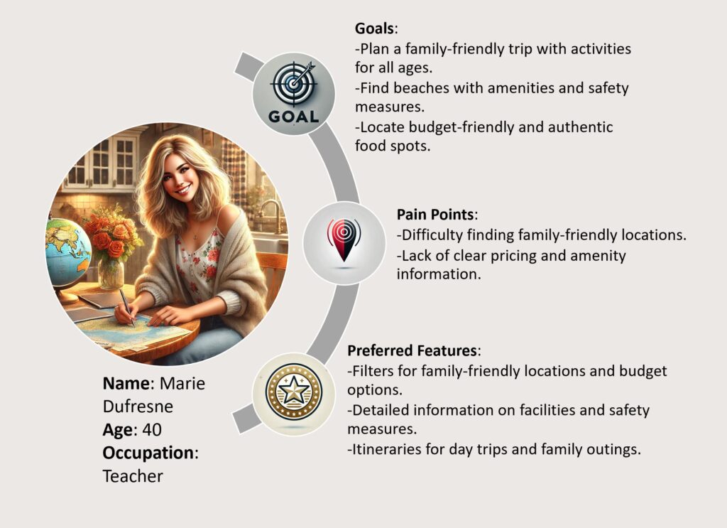
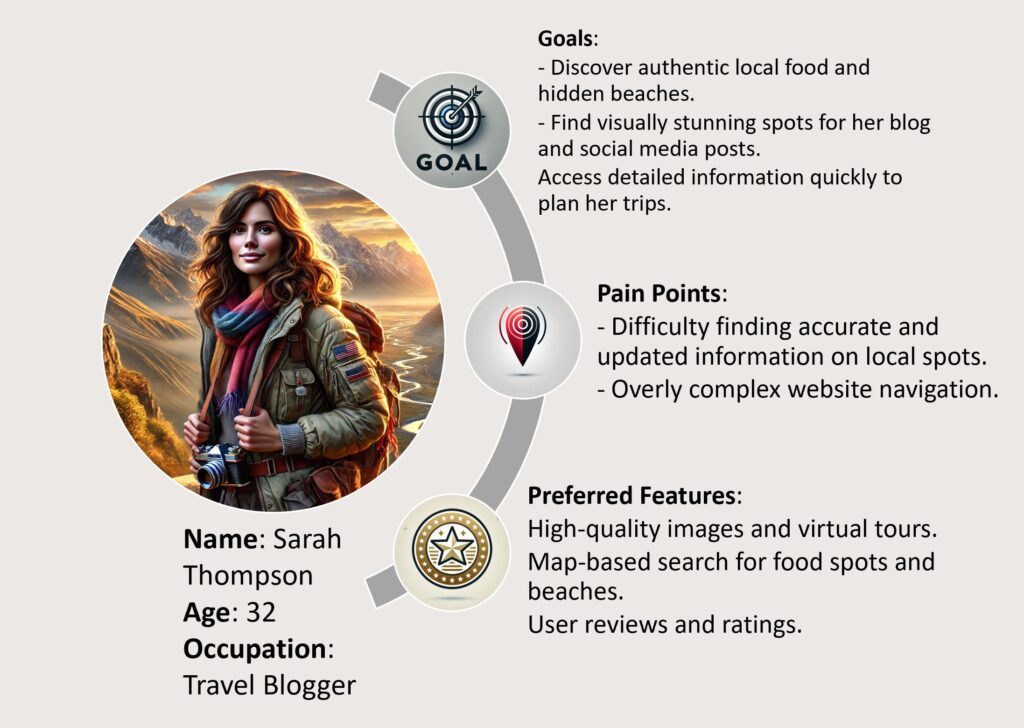
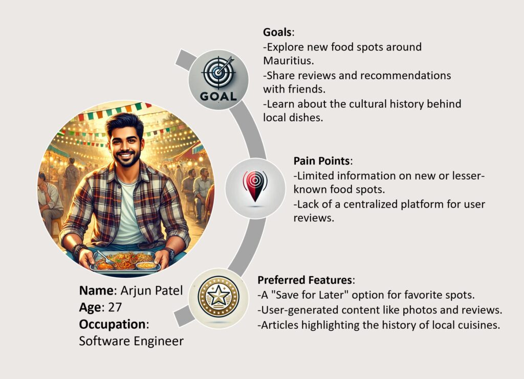
User personas
The user personas I created are so as I can try and represent my potential users. This will allow me to remain focus on the assumptions and hypothesis created.
Data Collection Methods
Interviews: Conduct in-depth interviews with tourists and locals to gather detailed insights on their expectations of the website.
Focus Groups: Engage groups of travelers to explore their preferences and expectations for a travel-planning website.
Observation: Analyze existing travel websites to identify gaps and opportunities for improvement.
Research Implementation Plan
The research will be conducted concurrently with the development of the major project, making it an ongoing process. The final project is due on 26/09/2025. Below is the estimated timeline for research implementation:
1. Survey (deadline: 20/01/2025)
I will create a survey form with the help of Google form and I will send it to my friend and acquaintances to fill out. The goal of this survey is to gather information about the content that potential users may want to see on the website. The survey will help me gather valuable qualitative insight from various users. The survey will help me reach people in Mauritius easily so as to have an insight on the locals point of view.
The most important part of the survey will be to compiling the data so as to be able to find meaning in the qualitative and quantitative data collected.
Below is a survey that will be send to as many people as possible (minimum 25) in order to have an insight on the users interest and expectation.
2. Card sorting (deadline: 20/02/2025)
Card sorting will allow me to help me organize my content by giving me insight on how users organize and categorize their information and content. The information that I will gather will allow me to finalize the layout and maybe the color scheme.
“Card sorting is a useful method when creating or reworking your information architecture, navigational structures and/or content organization.”
–Experience Management
3. Prototyping (deadline: 25/03/2025)
With the help of ‘Figma’ I will create a prototype of the website according to the insight gather from the survey and the card sorting. A prototype will allow me to show the website to potential users and allow me for further research. For this step I will have to dive into the world of ‘Figma’ so as to be able to deliver the best prototype.
4. Moderated User Testing (deadline: 14/04/2025)
Carrying a moderated user testing will require me to observe participant when they are using the prototype. During the observation, I will observe their reaction and their interaction with the website. This provides me with the insight about the users feeling and behavior. A well carried out moderated user testing will provide valuable qualitative data on the usability of the website. I will need to record the user’s experience when they are interacting with the website. I will also be able to guide and question the users.
5. Designing/Wireframing (deadline: 23/07/2025)
With the data collected from the different research tool I mentioned above, I will proceed to design and build my website accordingly. The valuable insight that I gathered will allow me to build the website with the users in mind.
6. Tree testing (deadline: 12/08/2025)
I will carry out a tree testing to allow me to focus on the efficiency of the layout. I will allocate specific task for my users and I will observe how they navigate the website and what they expect to see upon clicking any element found on the website. This technique will also allow me to have a more in-depth point of view on the hierarchy of my content.
7. Compilation (deadline: 24/08/2025)
With all the information gathered a final design would be generated. This will include every aspect of the website, from the logo to the color scheme.
Conclusion
This research will lay the foundation for designing a user-centric website that showcases the best of Mauritius. By understanding user preferences, improving usability, the website aims to provide an engaging and authentic experience. Future steps involve further refinement through user feedback and continuous updates to maintain relevance and usability. The website will be designed to be responsive, the website will provide a seamless experience across devices, ensuring accessibility and usability for all visitors.
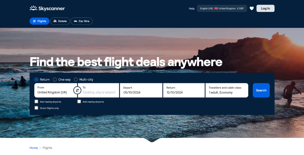
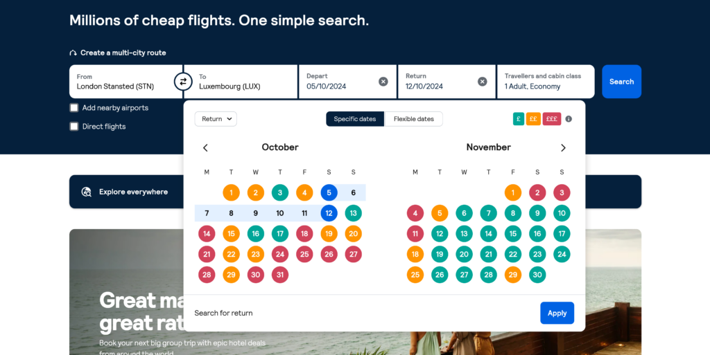
Skyscanner allows users to compare cheap flight prices from all major airlines and travel agents, and find the cheapest tickets to all their favorite destinations.
The website is simple and yet very effective as it is goal focus and the user can search for their flights easily and quickly, with the layout of the search bar found in the middle of the home page.
The search bar offers the opportunity to the user to navigate the different features of the website without constantly opening new tabs or windows.
User friendliness is another key point for the website. Upon selecting the dates for the flight the user is searching for, the website displays the date along with a key for their color coding. Dates are highlighted according to average prices for the specific flight being searched, making it much easier for the users to filter their search even further.
What makes Skyscanner one of my personal favorite is the fact that I can access different services all on one website and the transition between the services are seamless. I can get the best price while having full control on my search with little to no disruptive ads or sponsors. This is also confirmed by the numerous other users.
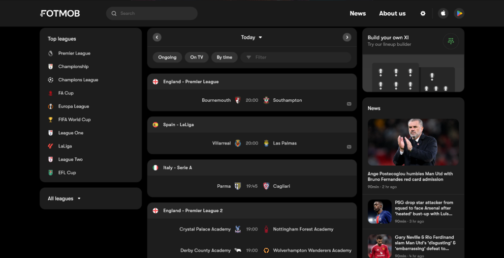
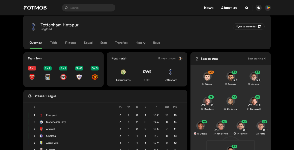
FotMob gives you all the live scores, stats, and storylines to keep you up to speed with the world of soccer. Personalized news and notifications make it easy to follow your favorite teams and players. And lightning-quick match updates make sure you never miss a goal, no matter where you are.
FotMob is one of the best websites for football fans. The user experience when using it is fantastic as users are given every piece of information in such an orderly manner. Various data are being delivered to the user with ever feeling overwhelmed. This is made so as the data are well classified and grouped together.
The distribution of content on the webpage is what makes it appealing to the user. For example on the screen itself we have loads of information but they are all in their own section allowing the user to have a good overview of everything while still allowing the user to focus on any piece of information being displayed.
Come On You Spurs !!
What makes FotMob a great website according to me is the ease of use of the website along with the amazing planning of all contents available to the user.
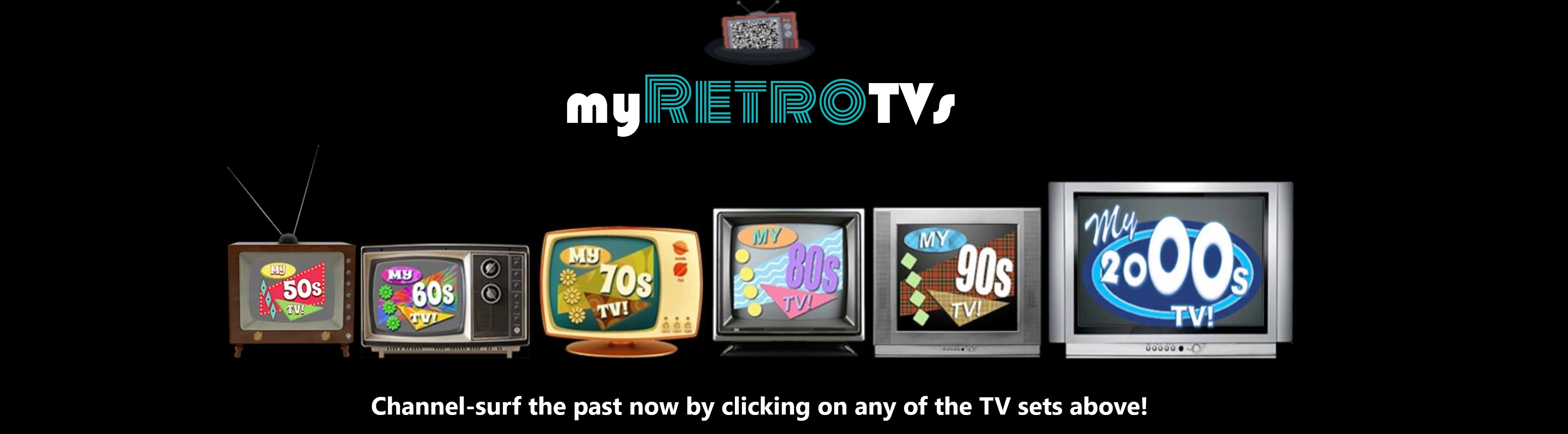
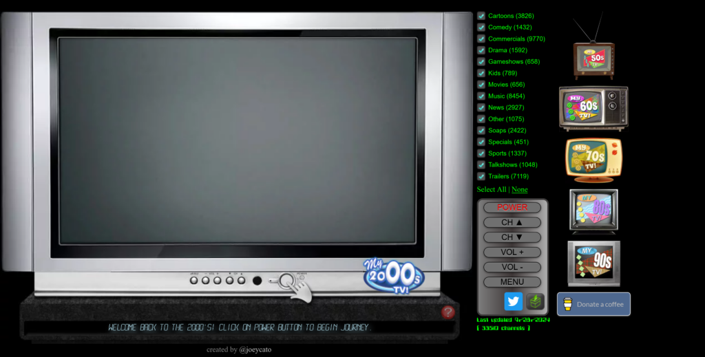
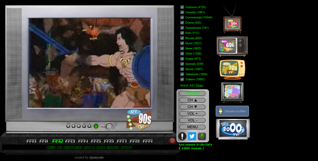
MyRetroTVs was created as a tribute to the beloved pop culture of the bygone eras, offering you the vintage experience of flipping through TV channels from a specific time period and trust me it does exactly that.
Seems familiar? The simplicity of the website brings back to nostalgia of the 50’s, 60’s, 70’s, 80’s, 90’s and 00’s. The design of the website is such that users only have to use a simple click on the old school remote to switch on the TV and zap around like the good old days.
The website to me is a very good design as it is very goal focused. The key point of the website is nostalgia and with the simplicity involve it does just that and it does it perfectly. The website also allows users to apply some filters while still having to zap in order to find something according to their taste, which from my point of view is a once again focusing on the nostalgia.
Some other additional features are added to further immerse the user in the chosen era. Depending on the years selected, the TV changes accordingly. Another great feature is the static noise use when changing channel. Those attentions to the details and the simplicity of the website is simply amazing.
In this task I am going to discuss three good designs that I found around me in my everyday life.
“Good design is obvious. Great design is transparent.” – Joe Sparano
1. PlayStation Controller
The Playstation controller, known and held by many all around the earth is one of the best design in the world if console gaming . Since 1997 with the introduction of the thumbstick, the Playstation controller has achieved to become the standard in terms of controller in the world of video games.
Some of the major concepts are:
Comfort
With the comfort and ease of use for all range of users and the numerous combinations of all possible input available for the various video games in mind, the dimensions, texture and weight of the controller feels like second nature whilst users are immersed in the virtual world of their video games.
The design allows a range of users, from children to full grown adults, to share the same controller as it fits perfectly in the hand and the layout of the buttons are such that after hours of gaming the strain and fatigue in the hand is negligible.
Button layout
The layout of the buttons with the iconic symbols known by many remains unchanged throughout the years as the design is intuitive to all users. The movement of characters in all video games simply becomes a muscle memory for the gamers.
Immersive
The controller is packed with so many features, apart from the simple buttons, such as vibration, touchpad, microphone and the recently added the adaptive trigger that the controller allow the users to immerse themselves fully in the experience without ever thinking of a controller being in the hand.
2. Measuring tape
The Measuring tape, an indispensable tool and one that’s found in every toolbox. The measuring tape found its place in every tool box and all households as the design and ease of use if of the product is such that all users can use it easily.
Lets discuss some major feature that can be classified as good design.
The thumb lock
The thumb lock is designed to keep your tape in place at your desired length. It stops your tape from automatically retracting back into its housing when carrying out measurements. Simply release the thumb lock to put the tape measure back in its case. This allows users to easily transfer measures without having to think about it.
2. The Hook
The hook, located at the end of the tape comes in handy when measuring hard surfaces such as tables. You may notice that the hook is loose; this is intentional to ensure accuracy as the hook moves horizontally to help users make inner and outer measurements without the hook changing the measurements. If the hook has a hole in it, this is so it can grip onto screws. The hook is also magnetic in order easily take measurement of metallic objects.
3. Belt clip
Does exactly what it says. The belt clip simply allows the measuring tape to be hooked onto your belt so you can always have it to hand. This ensure quick and easy access to the measuring tape.
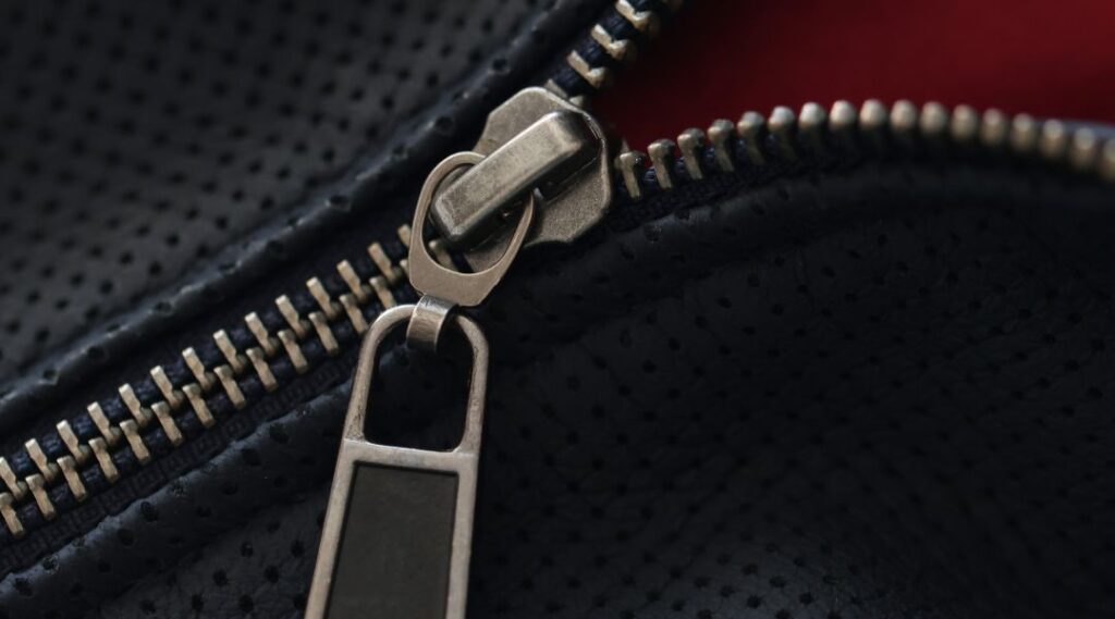
3. Zipper
A Zipper, named after it’s iconic sound, can be found all around us in our day to day life. A part of our daily life that goes unnoticed as it blends in the functionality. Think about your day and you will find that you most likely have used a zipper without even thinking about it.
What makes it great:
Fastener
The zipper is a fastener that locks in place with the help of a slider that interlock and releases the teeth of the zipper to allow opening and closing. It is a quick and easy way close or open any piece of clothing.
Ease of use
The zipper is easy to use as the user only have to pull the slider one way or the other to use it. The zipper can be used by almost everyone.
Secure
Once closed the zipper is as secure as it can be as the interlocking of all the teeth make it almost impossible to take apart.